Technology
A keyboard is not a list of buttons
Building a software keyboard is almost always a Bad Idea. The keyboards that come installed with our phones and tablets represent years of institutional knowledge and are fine-tuned for user experience and accessibility. A good keyboard is something you never have to think about, and it takes a significant investment to get there.
However, there are cases where you have no choice but to render your own. For example, in my mobile word game Sootly, each key on the keyboard has an animated, multi-color background representing clues for the puzzle you’re solving. In the first version of the app, I shipped a keyboard that consisted of little more than three rows of buttons in a QWERTY layout, with gutters next to A and L, plus Backspace and Submit buttons on the third row.
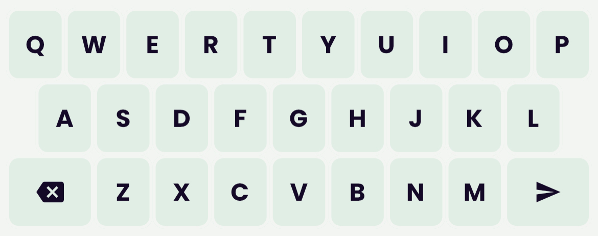
This technically worked. The game was playable. It was fun, even. But the keyboard never felt quite right; you had to pay close attention to it and sometimes it felt like a letter was getting missed. Why was that? There was nothing wrong with the buttons, to be clear. They all worked perfectly: tap a button, get a letter. But still, you could never quite get to the point where the keyboard disappeared into the experience, like with a native keyboard.
Eventually I got a clue, thanks to some feedback from my brother. I spent the next couple of weeks focused on rebuilding the keyboard and finally got it to a point where it feels natural. Here’s what I learned along the way.
1 - Keys shouldn’t have margins
Typically when you’re putting buttons side-by-side there’s an instinct to separate them. It looks nicer; nobody likes to see a row of buttons smushed together like one big pea pod. But on a keyboard, that instinct can lead to poor UX. People type on touch screens with high speed and low accuracy. If they type the wrong letter, that’s a typo; they’ll blame themselves. But if they tap the margin between two keys and nothing happens, they’ll blame the keyboard.
Take a look at this iPhone keyboard:
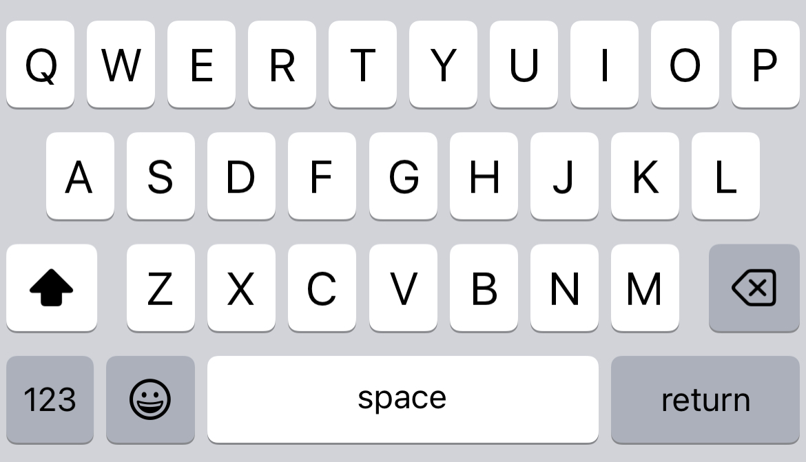
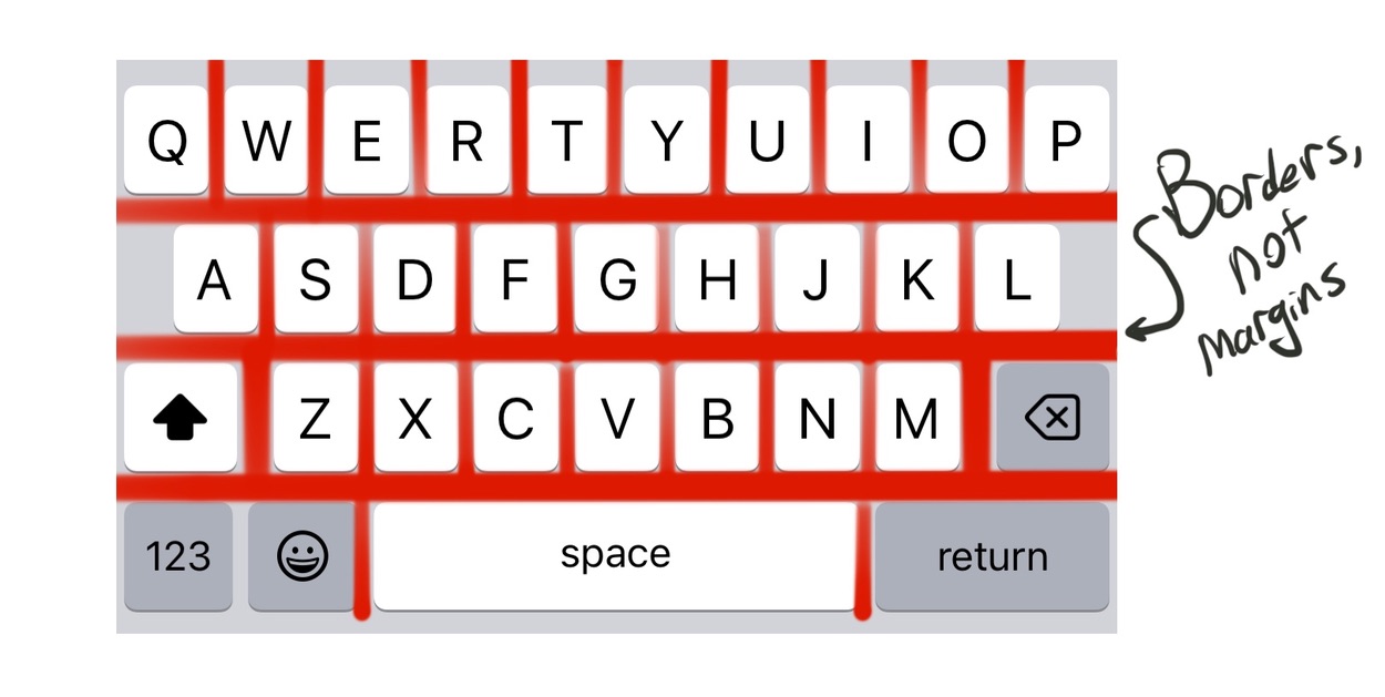
While there is visual separation between the keys, that’s pure paint. There’s actually not a single pixel you can tap within the rectangular keyboard area that doesn’t result in a keypress. If you try to tap the margin between two keys, it maps to the nearest key.
This may seem obvious, but the implementation is counterintuitive if you’ve never done it before. Probably the easiest solution in HTML or Flutter is to set margins to 0 and use thick borders (either transparent or the same color as the background).
2 - A and L should extend horizontally
The first row of a QWERTY keyboard has 10 letters while the second row only has 9. Software keyboards compensate for this by putting a gutter on both sides of the second row, roughly one-half the width of a key.
Hardware keyboards have a much smaller margin on the left side than the right, with A nearly below Q. L and P hardly overlap at all! But hardware keyboards have loads of physical feedback that software keyboards don’t, and the ergonomics are different anyway because you don’t use a physical keyboard with only your thumbs.
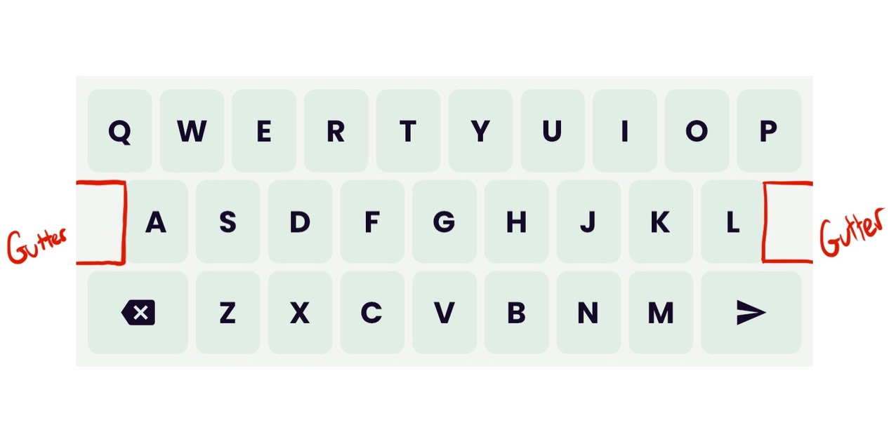
This gutter, importantly, is not a dead zone! There are no dead zones on an ideal keyboard. If you tap the gutter to the left of A, you get an A. To the right of L, an L. Smartphone users are conditioned to sacrifice accuracy for speed wherever possible, which means keys on the edges habitually receive less attention than keys in the center. And since A and L aren’t flush with the edge of the screen (which acts a tactile guiderail on other rows) extended tap targets in the gutter area will save a lot of attempted keypresses from getting lost.
The best solution here is platform-dependent, but for my money, filling the gutters with invisible buttons (or any rectangles that can register a tap) and mapping them to A and L is sufficient.
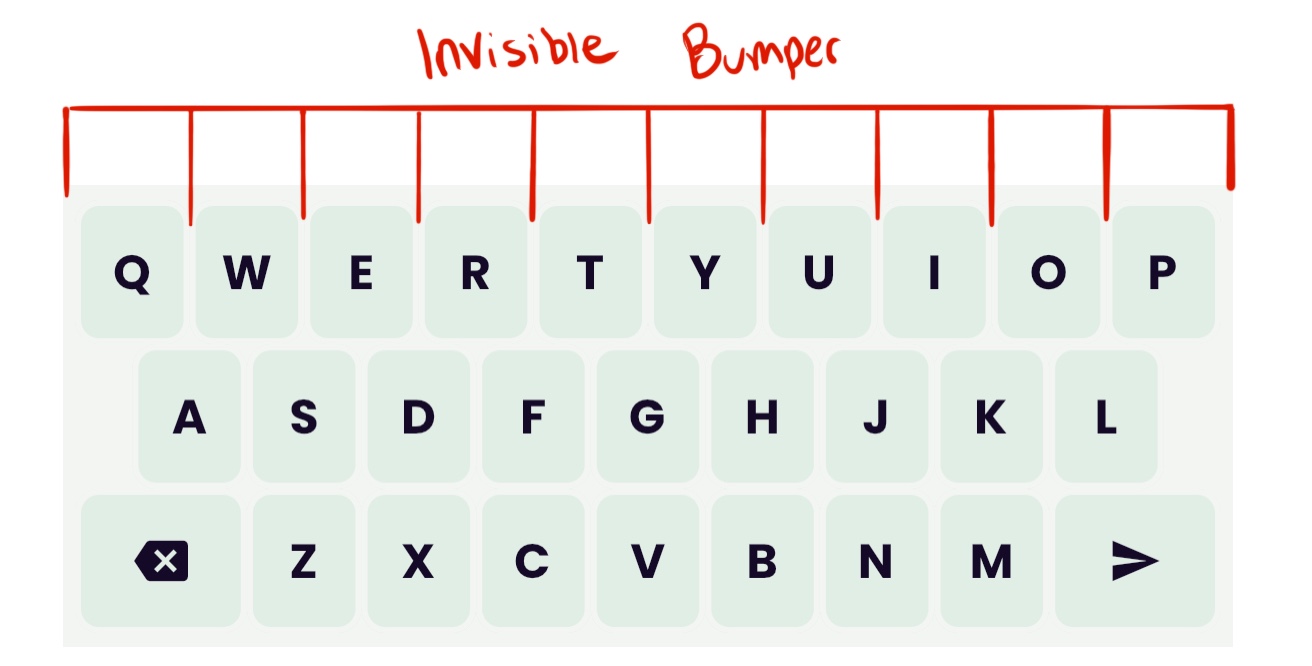
3 - The top row should have a bumper
As if the A/L gutter wasn’t forgiving enough, there’s another functional gutter on software keyboards just above the top row. Most modern software keyboards disguise this as a “suggestion strip,” but make no mistake, it’s part of the keyboard.
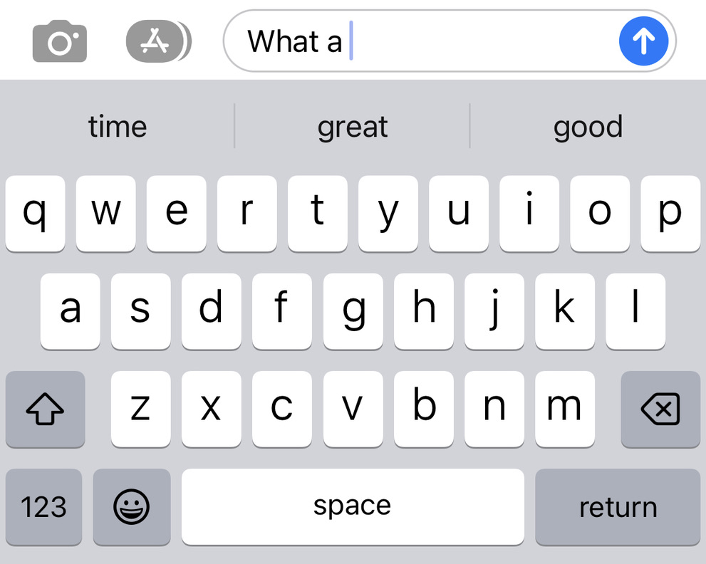
Try this: type the word WHAT in your favorite messaging app but instead of the T, tap whatever suggestion lies right above it. There’s no room for hesitation here—you need to tap just as fast as you would if you were typing the word naturally. On my iPhone, I still get a T. The keyboard knows I’m in the middle of typing a word, so it appropriates the suggestion strip as an extension of keys Q through P.
This may seem like a small thing but I’ve been amazed at the difference it makes. Adding this top-row bumper made my custom keyboard go from “mostly functional” to “effortless.” On a typical software keyboard there’s a bumper underneath the bottom row as well, but since my keyboard doesn’t have a space bar there’s less of a need for that.
The implementation: in my Flutter app, I used a row of invisible gesture detectors laid out just above the top row in an equivalent configuration. On web, I might have preferred to use an absolute-positioned element in each key to achieve the same effect.
4 - Per-key processing should be FAST
Maybe it’s (again) obvious, but keyboard buttons have to be significantly faster than regular buttons. Users will tolerate as much as 250 milliseconds between the time they tap an action button and when the app delivers visual feedback. On a software keyboard, that would be unacceptable. Even 100ms of per-key latency makes the keyboard feel jittery. While it’s true that the average smartphone user only types about 200 characters per minute—one character per 300 milliseconds—the delay between tap and response isn’t the whole story. Typing is a continuous feedback loop between thumbs, keyboard, screen, eyes, and brain, one that’s automatic to smartphone users. We type the end of a word before our eyes have registered the beginning. Even a small delay from tap to response can force the user to mentally rewind the loop, a jarring experience most of us are familiar with from the occasions when our phone or computer gets momentarily overwhelmed and we have to stop typing and wait for it to catch up.
Shaving milliseconds off keyboard response time is a worthwhile endeavor. This is bog-standard optimization work. If you can figure out where you’re spending the most cycles, you can streamline them, schedule them for later, or offload them to another thread to keep the UI responsive.
A keyboard is a deceptively large live tap zone
There’s a lot more that goes into a good software keyboard, more than I could possibly be aware of after such a short time. The above are minimum requirements to make a keyboard feel usable. High-quality software keyboards also use autocorrection, AI modeling, and round after round of usability testing to ensure they feel natural and produce the keypresses the user expects, even if they’re not necessarily what the user tapped on.
The best keyboard is the one the user brings with them. But hopefully, if I haven’t scared you off of building your own, I’ve at least given you a few guidelines to make it better.